
Branding That Goes Beyond Pretty: Telling a Visual Story
By Mike DeSocio
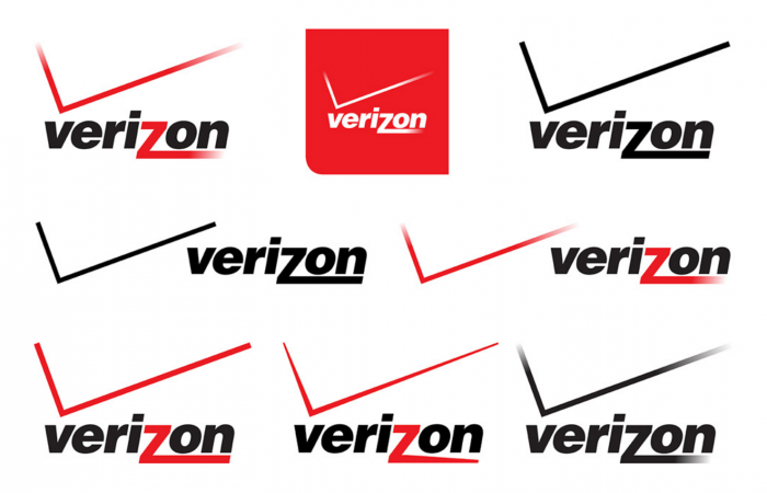
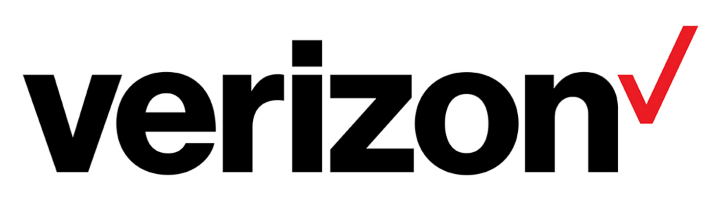
When Verizon unveiled its new logo in September, I had some serious doubts about the direction of the brand identity. The iconic “v” had been reduced to an unassuming checkmark; the swooshing “z” was relegated back to its original letterform. And what happened to the red that once dominated that color palette? It was downplayed to an accent color amid a sea of white.
It seemed that this was a big step from “exciting” to “boring” for the Verizon brand. But good brands aren’t always flashy and pretty. In fact, that has almost nothing to do with how effective a brand is. Good branding is about using visual elements to tell a consistent story, not about parading an attractive façade.
So what was the Verizon re-brand about? As their chief marketing officer, Diego Scotti, explains, the company had moved beyond simply providing a network. Now, Verizon is dedicated to helping its customers fully experience digital life — easily. The new brand set out to communicate the Verizon story of “simplicity, honesty, and even joy” in an industry marked by frustration.
The new checkmark in the logo? It may not be pretty, but it’s the simplest way to communicate, “We get things done.”
A quick visit to the Verizon website shows that it has taken this story beyond the logo — the ease and simplicity of the design makes it an outlier in the digital services space. AT&T’s orange and blue paired with a quirky typeface might seem prettier on first glance, but Verizon’s deviation from overwrought aesthetics cuts right to the core of the company’s story: We make your (digital) life easier.
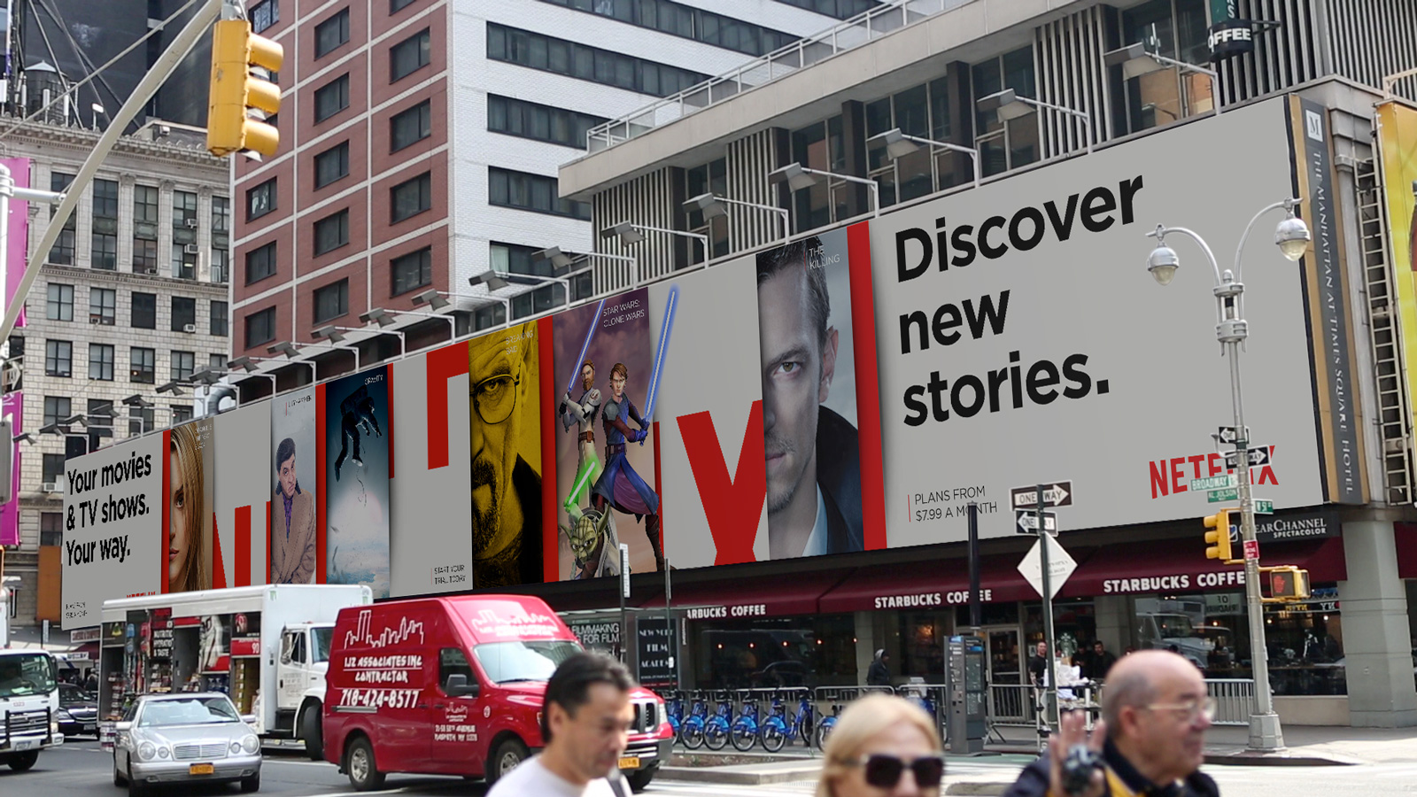
Verizon isn’t the only company to realize visual branding is about story and not beauty. Take Netflix… Its recent global ad campaign unveiled a new visual brand that simply and elegantly tells its story of providing an infinite, curated selection of the world’s best content. Netflix communicated this not through intricate graphics or showy ads. Instead, it developed a clean visual “stack” that mimics the service’s user interface and acts as a unifying storytelling thread. Every billboard, subway ad and webpage relies on this new visual brand. Well-designed, but not overdone. The message is undeniably effective: Netflix gives you a “stack” of infinite content curated just for you.
On the other side of the map are brands that simply try too hard, offering an overwhelming amount of visual bells and whistles that muddle the message. Fast Company recently unveiled a redesign of its website, which, for a company that has an entire silo dedicated to design, surprisingly missed the mark. Between the harsh diagonals, varying headline formats, and bursts of decorative shapes, its homepage comes across cluttered. While the article-reading experience is a bit better, the website sends the wrong message for Fast Company. Rather than emphasizing its sharp editorial voice and engaging content, the new visual brand tells the story of an overzealous design team.
As the digital space becomes more crowded, it’s harder for brands to tell a visual story that stands out. But before your company rushes to hire out a beautiful re-brand, think about how you can simplify your visual story to communicate your message quickly. Customers aren’t interested in the font or the shade of grey you select for your brand. They are, however, interested in visual stories that make their life easier.
Mike DeSocio is an Associate at Woden. Whatever your storytelling needs may be, let Woden help. Download our free StoryGuide, or send us an email at connect@wodenworks.com to discuss how we can help tell your story.