
Picturing Politics
By Kenly Craighill
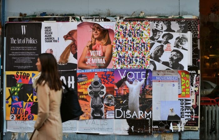
That the American voter is rational—critically evaluating the policies and promises of each candidate—is an idealist’s fantasy. The mass electorate is neither informed nor rational: most voters lack a comprehensive understanding of political nuance, let alone have made a full analysis of each candidate’s platform. Though some engaged citizens decide how to vote in response to healthcare, tax policies, social justice reform, or economic strategy, the bulk of American voters lack the time, education, or energy to read and evaluate the candidates who seek to represent them. When 150 million Americans head to the polls next November, the winner will be influenced by something much less data driven than their platform: a candidate’s visual brand—elements as simple and as complicated as symbol, font, color, and composition.
People subconsciously assign snap judgements to virtually everything they see, especially when it’s something they aren’t familiar with or don’t completely understand. Visual cues shape the perception of whatever catches a person’s gaze, and it happens rapidly without awareness. As much as candidates might prefer to lean into specific policy proposals, this contradicts that the brain is wired to make these fast visual assumptions—whether people want to or not.
If conclusions can and will be drawn from visual cues alone, it’s important to manipulate them strategically—aligning them with whatever lies beneath the visual veneer. Effective politicians recognize this as an effective way to lay the emotional groundwork for, and subtly communicate essential elements of, their story: either accelerating or extinguishing a candidate’s reputation, garnering attention, or influencing the outcome of a last-minute decision on the walk into a polling place.
As the 2020 US presidential election rapidly approaches, candidates in the heavily-contested primary for the Democratic Party’s nomination are attempting to create compelling visual brands that connect their story with the American electorate. What do voters really see when they pass a blue and yellow Pete Buttigieg lawn sign, a vehicle adorned with a stark black and white Beto O’Rourke sticker, or one of the many red, white, and blue campaign logos? Hopeful candidates have plenty of recent history from which to draw inspiration.
Though she’s not one of the aforementioned candidates for president, few politicians have captured the public’s attention like the freshman representative from New York’s 14th District. As an insurgent candidate in the 2018 midterm election, Alexandria Ocasio-Cortez needed an exceptional visual strategy to wrest away attention from her incumbent opponent, and she made an impression the moment her posters hit the streets of her district.
American political candidates have long relied on red, white, and blue color schemes to signify patriotism, but AOC’s campaign posters broke from that heritage. She scrapped convention entirely, opting instead for a royal purple: a visual manifestation of her goal to reinvent partisan standards by blending red (connoting the GOP) and blue (representing the Democrats.) Purple serves as the background for an upward tilting logo which spells out her name in an all-caps sans serif font, which is hugged by inverted exclamation marks pointed with stars. The title “Ocasio” is set against an angular speech bubble, large enough to encompass nearly a quarter of the poster.
The exclamatory Spanish grammar reflects AOC’s Puerto-Rican heritage, and invites acceptance among the many Spanish speaking voters in her district. The sharpened speech bubble provokes an intense sense of urgency, and the text’s upward compositional tilt inspires hope as it rises confidently from its beginning—it’s evocation of phone-based messaging apps only helps to reinforce her age, and digital bona fides.
Sure, the design of AOC’s brand was pleasant, unique, and appealing. But, more importantly, the poster ensured that before they knew anything tangible about her radically progressive politics, the instant visual judgement from viewers would communicate different aspects of her experience and principles.
At the other end of the spectrum (politically and aesthetically) from AOC , are the voters doffed in red “Make America Great Again” hats who swarmed in droves to Donald Trump’s campaign rallies during the 2016 election. The Trump 2016 campaign poster fully embraced an all-American color palette: using red, white, and blue to proudly remind voters of America’s past, and to declare Trump’s strong association with nationalism. Beyond color, though, Trump’s logo offered something new.
“TRUMP” slams viewers with a stout all-caps text, occupying most of the poster and mirroring Trump’s hubristic presence and historic demand for attention. Surrounding his name on each side are five stars, and the “Make America Great Again” slogan. The phrase’s authority in the logo forges a connection between himself and other patriotic Americans—particularly those nostalgic for previous incarnations of America. The lack of sophistication in the design, however, shunted previous, patriotic logos. Gone were the subtle, serif designs of either Bush or Mitt Romney—a design decision that signified exactly the voters Trump was seeking to reach.
Though Trump’s visual brand solicited eye-rolls from graphic designers, it was undoubtedly effective. This is visual storytelling at its most primal: prioritizing the message that must be communicated over aesthetics. Trump puts himself front and center, which viewers can’t miss from the logo. And while it may be a “not very imaginative, so generic that it might well have been churned out by some ‘your-design-here online vendor’” design, it clearly communicates his preference for directness.
The current crop of presidential candidates are aware that their visuals absolutely must communicate their campaign story, as voters will “hear” their visual brand well before a stump speech. Women and people of color tend to be more adventurous with their color and font choices, which helps communicate and reinforce the ground-breaking nature of women and minorities seeking the presidency. Kamala Harris, for example, has a campaign logo unlike any previous American candidate: a dense, collaged composition, with tall, attention-grabbing letters in purple and red. Designers have compared it to the pins of the first African-American woman in congress, Shirley Chisholm, and note that “it’s really remarkable how difficult it is for American candidates to stray from red, white, and blue… the use of typography and color evoke activism and optimism… most regular people will just think it looks surprising and fresh.” It’s a design that not only reflects her personal diversity, but embodies the direction she seeks to take the country and the ideals she wishes for voters to associate with her.
Elizabeth Warren—a current front-runner in the 2020 election—presents the same divergence from stereotypical norms, and though its slightly more traditional, it still strays from the red, white, and blue color palette of which American candidates have been so tightly bound. The refreshing mint color that sets her title has been officially named “liberty green” by her campaign, associating Warren with the Statue of Liberty—a woman of symbolic American freedom. Other women, like Marianne Williamson, more directly gender a logo to forge an entire identity of her position as a woman candidate. The ballet pink and purple color scheme is on the fringe of election standards, accompanied by hearts and a novelty font spelling “2020.” While it’s not a campaign brand anyone has seen before, Williamson isn’t a conventional candidate—her self-description as a “bitch for God” and moony spiritual beliefs has deemed her “a cross between Stevie Nicks, a Tennessee Williams character, and your mom after she took too much Xanax on a plane.” It’s only right that her campaign visuals reflect such feminine obscurity.
Women and minorities, however, aren’t the only ones testing the waters of a more adventurous visual brand. Pete Buttigieg chooses to include only his first name in his logo, encased in a bridge-like shape that connects two “20’s.” It’s no accident that the shape surrounding Buttigieg’s title references a bridge—it’s a literal reference to the Jefferson Boulevard Bridge in South Bend, Indiana, the city in which Buttigieg serves as mayor. But, at a more emotional level, the bridge serves as a reminder of the candidate’s position to mend the “divides tearing this country apart.” In a country adrift in a polarizing sea of opposing beliefs and morals, this message is a significant promise of a kinder, more compassionate electorate. For a voter walking into the 2020 primaries without much knowledge about his actionable plans for legislation, that bridge might just be enough to gain Buttigieg a vote.
Though the trend toward unconventionality and a more individual display of personality has defined many modern candidates, some front-runners of next year’s election hold true to more established aesthetics. Joe Biden, past vice president to Obama and hopeful 2020 president elect, touts his association with Obama by mirroring many aspects of the former president’s logo. The “O” shape is the heart of both logos, with Biden’s sweeping red stripes linked inextricably to the flag-like landscape touted by Obama’s campaign. While some designers see this as a cop-out, recycling his superior’s design, it’s not holding him back—Biden is leading in the polls, and his familiar logo provides his supporters the comfort of past politics associated with Biden’s political background. Had Biden strayed too far from the company already so heavily associated with his beliefs, his supporters may have felt rejected—concerned that Biden may be straying from his already established left-leaning narrative.
Too often, organizations—political or otherwise—value their visual brand for pleasant aesthetics. But, effective visual storytelling reinforces the core message of the cause, candidate, or organization it represents above all else, and inspires people to action. Political campaigns understand this better than most: elections are zero-sum games, with a vote for one candidate coming at the expense of all others. The ability for powerful visuals to shape perspective and lay the groundwork for a more complex story, before a viewer even realizes that’s what happened, makes it a powerful tool for those ready to inspire audiences to action.
Kenly is an associate at Woden. Want to stay connected? Add Kenly on LinkedIn, read our extensive guide on how to craft your organization’s narrative, or send us an email at connect@wodenworks.com to discuss whatever your storytelling needs may be.